Jun 9, 2012

Learn Wildlife For Kids - Color Book Fun

A good way to get kids interested in learning is, obviously, to make it fun. To get kids interested in learning about wildlife, and wildlife art, I thought it might be fun for them to color some wildlife art images. This will encourage them to take a closer look at the animals than they might do otherwise. When coloring in an image the child will need to observe more closely the animal's color, anatomy, and habitat.

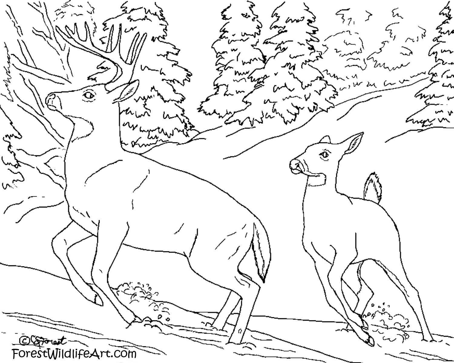
Here's one of my deer paintings, Startled, a picture of two whitetail deer running in the snow. I've converted to a line drawing so kids can color it in for fun.

Click on the image to see a larger version. Then right-click on the larger image and select "save image as..." to save it to your hard drive. You can then print it out and your child can color it in with crayons, colored pencil, or whatever he/she likes. If your printer can handle it, you might even try printing it out on watercolor paper so your child can explore painting as well.


Here is the original full-color painting your child can use for reference. He/she can try to match my colors or explore new colors. Try coloring several pages, each with a different color theme. Try to be realistic or go wild! But, most of all, have fun!


Let me know if your child enjoys this and I'll post more in the future.

Jun 8, 2012

Whitetail Deer and Waterfall Painting

I recently finished this painting of a whitetail doe and buck walking along a stream with a small waterfall, titled 'Follow Me'. This is a little different from my usual more realistic style. I wanted it to be a little more painterly with softer colors so it had an almost romantic fantasy feel to it. Even though deer may not really fall in love I wanted this painting to have the feel of romantic lovers wandering off to be alone together.


Follow Me
18"x24 oil on canvas

Water is not easy to paint. I've had a hard time painting calm water before so I thought the flowing water here would be even more difficult. Actually, it turned out to be easier. With moving water you don't have to worry about all the ripples and how they affect reflections like you do with calm water. The waterfall actually turned out to be quite fun to paint.

I plan to do some more waterfall with wildlife paintings in the future. What other wildlife subjects would you like to next to a waterfall? Bears? Otters? What else can you think of?

Jun 5, 2012

Tiger Eyes Study Mini Painting

I haven't painted a tiger in years. So, as a warm-up to a larger painting, I'm doing a series of small tiger study paintings. Here's the first one hot off the easel today.


This is a very small 5"x7" painting, probably the smallest painting I've ever done. I deliberately made it small to prevent myself from trying to paint too much detail, as I tend to get obsessed with detail, and I wanted this to just be a quick warmup exercise.

(This painting is available for purchase. Click here for details.)

Jun 2, 2012

The Difference Between the Way Artists and Non-artists Perceive Color

In my previous post I showed some quick Photoshop drawings of various color schemes for a potential horse painting. Having a hard time deciding which one to go with, I presented the choices to others and asked their opinions. I asked a group of artists and a group of non-artists. I expected the total votes of both groups combined to present one clear winner. Interestingly, the artist group's "winner" was very different from the non-artist group's choice. The artists overwhelmingly preferred the palomino while the non-artists almost all chose the blood bay with the green background.

Palomino:


Blood bay:


Of course I expected different preferences from different individuals, but I still expected the overall preference of both groups to be similar. In fact, they appear to be polar opposites. The artists seem to prefer the more harmonious combination of yellows and creams. The non-artists talked about the appeal of the lively and vibrant color contrast between the reds and greens.

I'm not sure why the difference in preference. I guess as artists we tend to want color harmony most often, while non-artists tend to be drawn to more eye-catching images. Of course, my little color test here was with small groups of people and far from scientific, but the opinions seemed different enough to be worth thinking about. If we want our paintings to sell, do we paint to please ourselves and other artists? Or do we try to appeal to the more likely buyer, the non-artists?

Of course, in the end, you have to paint what's in your heart. If painting vibrant colors makes you nauseated then it will show in your work and it's probably not a good idea to do it. But if you like the idea of challenging yourself it might be worth giving something different a try and see how it appeals to your audience.

Have you ever experimented with opposite of what you normally do, whether in color, style, or subject? Did you find it fun or frustrating? What was the response from others?
May 31, 2012

Mare and Foal Painting Color Concepts

Whoa, two blog posts from me in one day! That's a first!

I have not done a horse painting in years. Since it's spring I was thinking it would be fun to do a mare and foal in a field of flowers. (Yes, cutesy, I know! But what's wrong with cute?) I did some quick color concepts in Photoshop to try to determine what color palette I should go with. But I'm having a hard time deciding.
Which colors do you like best and why?

Palomino:


Buckskin:


Bay:


Blood bay:


Blood bay with green background:


I could also mix them up I suppose. Maybe a bay foal with a buckskin mare, for example?

Chickadee Painting Revision

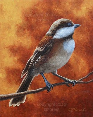
Another "finished" painting I decided to go back revise, a painting of the chickadee. This was not so dramatic a revision as the previous one, the impala painting. But I think it still had a significant impact. Here's the original:


The background was a little too barren in the original version. The idea behind the orange colors was to convey the feeling of autumn. But, without an clear indication, it could just as easily be a forest fire! Haha! It needed a little detail to bring out the fact that it's autumn in the scene. The addition of a few vine maple leaves helped convey this as well as add some visual interest to the upper corner that was pretty plain and uninteresting before. I think it also helped balance the "weight" of the painting. What do you think?

May 27, 2012

Wildlife Galleries Of My Past

While digging through some old photos looking for reference for my next painting, I came across some photos of me and my paintings in art galleries that I thought might be interesting to share.

The first gallery I was with was the Parkhurst Art Galleries in San Pedro, CA, representing the wonderful seascapes of Violet Parkhurst, now sadly deceased. She was a wonderful lady giving a young unknown artist like myself a chance by sharing a corner of her gallery with me.


It was a good first step and I'm grateful she gave me that opportunity. I did sell a few paintings through her gallery. However, since the gallery focused mainly on clientele interested in seascapes, it was not the ideal gallery for my wildlife art. A better opportunity soon came along. Artworks, Etc. in Fountain Valley focused exclusively on wildlife and western art. It was the perfect place for my art. The gallery owner and staff did a great job of promoting my art and my paintings sold very well there. I had a hard time keeping up supplying them with new paintings. What more could a new artist ask for!?


I worked with Artworks, Etc. for several years. It was a great gallery to work with. Unfortunately for me, the gallery owner retired and the gallery closed. Ah well, we had a great run! Time to move on.

So now, here I am, seeking a new gallery, hoping I can find one as wonderful to work with as the previous galleries. If you know of any galleries looking for another wildlife artist send them my way! :)

Shop Art Supplies

Related Posts Plugin for WordPress, Blogger...