Showing posts with label Photoshop. Show all posts

Feb 1, 2017

Deer Painting - Fawn WIP2

In my previous post I started blocking in a cute whitetail fawn. In this post I continue working the fawn's shading and fur.

With my "fur" brush, shown on the right here (Photoshop CS5), I start working the edges of the different colors to give them somewhat of a fur-like texture instead of just hard straight lines. I've started doing this below his ear in this image.


My fur brush is really just a simple elongated teardrop or bullet shaped brush stroke. Google how to create PS brushes to create your own brush. I won't get into PS basics here. But I'll give you my default settings for this shape to create a fur-like pattern. The most important thing here is to turn on Shape Dynamics and set the Angle Jitter Control to Direction so that you can control the direction of the fur by the direction of your brush stroke. Set the Size Jitter to about 20% and turn Control to Off. Next turn on Scattering and that to about 80%.


After getting all the edges furred up now we start blending those edges to give them a softer look. This harsh color change doesn't look very natural. To do this you can either use this fur brush with a Mixer Brush to blend the edges, or use a regular brush and click Transfer in the Brush panel (or click Tablet Pressure Controls Opacity at the top tool bar). I prefer to use a regular brush with Tablet Pressure Controls Opacity because the Mixer Brush tends to blur things too much. I want to blend the color tones without making the individual hairs too fuzzy.

Here you can see I've been working the edges to soften them. As you work the edges keep changing the color from one side of the edge to the other, overlapping them a few times. You don't want it to look like only one color overlaps the other. You want to go back and forth to get a more naturally blended look.


And here's the little cutie-pie all finished and in his natural surroundings. Feel free to leave comments if you have any questions.


Jan 23, 2017

New Birds and Fountain Painting

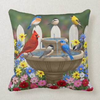
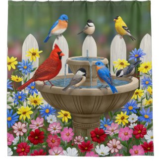
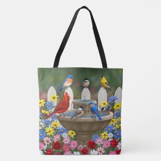
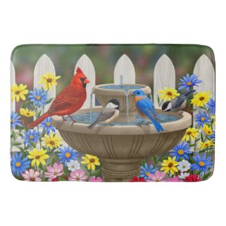
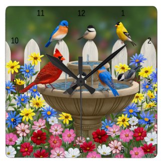
I am already looking forward to spring! My first painting of the year is of a spring garden with birds around a water fountain style bird bath.


You may recognize the bird bath from a painting I did a couple years back, shown below. Since these are digital paintings I will admit I reused the water feature. But I did change its color a bit, and everything else in the scene is different. Instead of purple clematis clinging to the fence, I now have cosmos flowers among the daisies around the fountain. Instead of a "spear" style picket fence I now have a Gothic style. The bluebirds and goldfinches are in different positions, and I've added three black-capped chickadee and a male red cardinal. The background is also different, with a softer look to give more depth of field. So, overall it has the same feel but is very different in many ways.


I've actually had some people say they do not like bluebird landing on the fountain in the old painting. I'm not sure what it is about the bird that bothers people. Perhaps the wide wing spread and feet extended give people the feel of an eagle or hawk about to land on its prey, so perhaps there's a subconscious negative connotation there. I personally love seeing birds in flight. Their wings are so beautiful, especially when the light from above shines through them, giving them a heavenly glow. But, if that's not your thing, there's now a new version where all the birds are just sitting and quietly socializing in the warm spring sunshine. :)

There are, as usual, prints and other products available featuring this new artwork. Visit my Pixels site for fine art prints and greeting cards. Visit my Zazzle store for other products, all of which can be personalized to make unique gifts. Below are a few sample products including a throw pillow, shower curtain, tote bag, bath mat, and wall clock. See more products here.


Dec 20, 2016

A Simple Way To Find Stray Pixels in Photoshop

If you work in Photoshop or something similar you know what an advantage it is to keep different elements of your art on different layers. This allows you to add, subtract, resize, or move elements in your scene around, or remove the background altogether.

Since I've been doing more digital art I'm also doing more art where the subject can separated from the background scene and saved as a PNG file with transparency. This is useful for putting the image on products, particularly things like t-shirts and coffee mugs where you don't want a square photo-like picture on the product.

One of the things to keep in mind when creating images for shirts, and some other products, is there is no such thing as white ink. So when the printing company puts an image that contains white or light colors onto a dark shirt they have to put a white undercoating down first, then spray the darker colors over it where the image is not going to be white. They put the white coating down based on the pixels in your image so if your image doesn't have clean edges you may get a white outline or stray white spots outside the main image. So it's important to find any stray pixels or jagged edges and clean them up.

These stray pixels can occur without you realizing it, if you accidentally bump your brush against your drawing tablet when using a light color or lower opacity. Or perhaps you erase part of the image. It might look like you got it all but even 1 tiny mostly transparent pixel will cause a white undercoat to be laid down there on your shirt or other product. Finding that tiny pixel can be hard just by eye-balling the image. So here's a quick little trick to bring those little guys out of hiding.

Here's my original image, one of a silly chicken in a Santa hat I created for Christmas stockings and shirts. It looks pretty clean outside the edges, right?


Well, looks are deceiving. I know it's not that clean in reality because I created this from another image, moving the chicken's head a bit and erasing the old part of the head and neck. I'm sure there are pixels that I missed that need cleaning up. But I can't see them. So what we do to bring them out is right-click on the layer in the Layers panel and select Blending Options. In the panel that pops up go down to the bottom and select Stroke. Play with the size until you can see spots appearing outside the edges of your image, but don't make it so big it covers small pixels near the edge. Pick a color that's different from your image edges so you can see it better. Here's what I get with mine.

As suspected, there are stray pixels around the hen's neck where I didn't quite erase it all when adjusting the bird's head position. I need to clean those up so they don't produce spots when printed on dark fabric. To do that I just use the eraser tool and dab those spots. The nice thing about the Stroke blending option is that, as you erase the pixels, the Stroke outline will disappear too, letting you know you got it all. (Don't use the Stroke under the Edit menu for this...you won't the same results.) Here's the chicken with edges cleaned up.


When you get your image all cleaned up right-click on the layer in your Layers panel and select Clear Layer Style. Now it's back to how it appeared originally but you know you've cleaned up any stray pixels so you'll have a nice clean print on your shirts and products.

And here's my chicken on a "Merry Chickmas from your local chicken farmer" shirt.


Oct 17, 2016

Progress on my Texas bird and flower art

In one of my previous posts I shared my new line drawing version of my Texas state bird and flower artwork featuring the mockingbird and Texas bluebonnet. Here I'm making some progress on a color version.

In this first image I've blocked in the main colors of each area.


Next I've blocked in the color gradients forming the basic shading and highlights. I did a little color shift on the banner to better match the color of the flowers.


Here's a little closeup of an area showing the blocked in colors.


Next will come the blending of the colors, and coloring the outlines to match. Then I'll have the finished artwork! I'll share that next time.

Sep 14, 2016

New Christmas Birds Digital Painting - WIP4

In my previous Christmas birds post I had just finished up the 3rd bird, the black-capped chickadee. In this one I'm sharing a quick progression of the 4th and final bird on the fence, the eastern bluebird.


I'll start with the outline image I sketched for the basic size, shape, and placement of the bird.


Next here I've blocked in the bird's basic colors.


Next, I remove the outline layer and start adding the details, texture, and shading. Here you can see the texture of the feathers on the head as well as eye detail.


And here's a detail of the wing feathers defined.


And finally, the finished bluebird!


Next I'm moving on to adding more decorations to the garland on the fence. Then I'll add a little bit of background and snow to the painting and it will be done! Stay tuned.


Sep 6, 2016

New Christmas Birds Digital Painting - WIP3

In my previous post on this topic I was working on the female cardinal. In this post I've moved to the chickadee. Starting with the outline sketch I did, I use this on a separate Photoshop layer as a guide.


Next, on a new layer under the outline layer, I block in the basic body colors and markings. I use a medium shade of the main colors so I have some room to add darker colors for shadows and lighter colors for highlights without getting too dark or too light.


Here I'm starting to adding the wing markings which, on the black-capped chickadee, have lighter edges. I'm just roughing in the areas at first, then I'll blend and texture them later. I don't need the outline anymore so I've hidden that layer to better see the feather edges.


In this image I've started texturing and shading the body feathers.


Here's the finished bird, with wing and tail feathers blended and body feathers textured. I waited until after I blended the wing feathers to add the body feathers to the bird's back because those back feathers overlap the wing feathers. In general, you want to work from the lowest layers and work your way up to the top layers so you get a natural overlapping look.


So there it is, an adorable black-capped chickadee sitting on a snow covered fence post. Next I'll be working on the bluebird in the scene. Then all four birds will be done and I'll moving on to the garland decorations.


Aug 30, 2016

New Christmas Birds Digital Painting - WIP2

In my previous post on this topic I started out showing you the general composition changes I'm making for this painting, and the modifications to the male cardinal. In this post I'm showing changes I've made to the female cardinal.

Here she was originally.


Now in this image you can see the changes I'm making to this bird. I'm rotating the body to face the viewer more. This means showing more belly and less wing. It also means changing the angle of the tail to show the underside instead of the top. I've blocked in the basic colors here.


I sketched a black outline on a separate layer in Photoshop to help me out. If you're modifying an actual oil painting you can draw this out right over the dried paint with a pencil. I like to draw the sketch on a piece of graphite paper or double-siding a piece of tracing paper (To double-side tracing paper, draw on one side, then trace it on the other side. Flip it back over and put it over your painting. Then retrace the first side and it will leave a graphite imprint on your painting.) I like to do the graphite tracing so that I can use it again and again. This is good for creating a painting from scratch as well as modifying. Often, when you are painting over your graphite lines, you lose track of where you're going. Being able to place the tracing over your painting again to remark the areas can be helpful for getting back on track.

After blocking in the shape I start fixing the details. Here's a closeup of the body feathers.


Body feathers have a texture similar to fur so I'm using my fur brush for this part of the bird. My fur brush is a regular teardrop image I created added to the brush presets with the following settings.


For wing and tail features I use a regular round hard PS brush to block in the basic colors and shading. Next I switch to the Mixer Brush and use a soft round brush to add more transition shades.


After you have enough shades of color turn off "Load the brush after each stroke" at the top menu and just spend some time blending the colors. Switch to a 50% hardness and turn on "Tablet pressure controls size" to give the feathers some texture. Move your brush strokes in the direction of the feather's natural texture which is outward from the center at an angle downward toward the edges. Do an image search of bird wing feathers if you're not sure what the feather detail looks like.

Here I'm done with the female cardinal for the most part other than some minor touch-ups.


I'll be moving on to the chickadee in my next post.


Aug 22, 2016

New Christmas Birds Digital Painting - WIP1

Since the holiday season is not all that far off now, I'm starting a new digital painting of birds in a Christmas themed setting. To save myself some time I'm going to use some elements from one of last year's holiday themed bird painting, my Christmas Cardinals Feast painting shown here:

http://forestwildlifeart.com/birds-cardinals-christmas-feast.htm


I like the idea of the birds on the fence strung with xmas garland. But for this year's painting I want to simplify the background and add more birds. Last year's painting was a nice, overall wintry scene. But this time I want to make the background less important and focus more attention on the birds and garland.

Here's my first work-in-progress (WIP1) post. Starting out I've removed all the background, including the bird feeder. I'll add a more subtle snowy background in later. I've also removed the big red ribbon and moved the jingle bells from the bird feeder down to the fence. On this smaller canvas the big red bow was competing for attention with the male cardinal.


As you can see I also added the outlines for a couple more birds. Next I modified the male cardinal a bit. I don't want the birds to be exactly the same in different paintings. So I rotated his body a bit so you see more of his back and wing feathers, and I turned his head so he's looking more to the right.

Next up I'm going to modify the female so she's not exactly as she was in the previous painting either. Stay tuned for WIP2.

Aug 1, 2016

California State Bird and Flower Color Version - Finished!

In my last post about my CA state bird and flower artwork I had said I was pretty much done except for one important thing I needed to do. Well, here it is, the final finished artwork with that "important thing" completed. What is that important thing? The outline. Yes, it had an outline already. But the simple black outline was a too stark and I wanted to soften it a bit for the final images.


One of the advantages I have working digitally that you can't really do when coloring in line art with a pen (or pencils, pastels, etc) on paper is that I can color over the outline. I colored the outlines to match the objects' base colors so they still have an obvious outline but one that is a little more subtle than the harsh black.

Here's a closeup of part of the image. You can see I used dark brown to outline lighter brown wing feathers, dark blue-gray to outline the blue-gray tail feathers, darker orange to outline the poppy flowers, and dark green to outline the leaves and stems.


This is a technique often used in traditional 2D animation, most notably in Disney's classic animation films, to give the characters a softer, more elegant and sophisticated look. Here are some snips of images from Disney's classic, Sleeping Beauty. As you can see in this first image, the birds all have outline colors that match their respective body colors.


Typically the outline color is a few shades darker than the main body color when that main base color is a light to medium shade. When the base color is dark to black, an outline a few shades lighter is usually used, as you can see in this picture of Maleficent and her raven.


An exception to these rules is sometimes used to make something stand out. In the image below they did the opposite of the usual by outlining Sleeping Beauty's light blonde hair with an even lighter color. This gives the impression of sunlit highlights in her hair and gives her a more angelic look to accent her beauty.


Why did I use this technique for my CA bird and flower? Because I wanted to give it a more sophisticated look than a typical kid's colored-in line drawing and I think this style really makes a difference there.

I have always loved the beautiful artwork of Disney's classic 2D animation films. It's a shame they don't do this much anymore. While technology has enabled them to do some incredible things with 3D computer animation, I think traditional 2D animation is an art form in its own right, not to be replaced by 3D computer art, but to have its place along side it. What do you think about 3D vs traditional animation art?


Jul 30, 2016

California State Bird and Flower Color Version -WIP6

In my last post I showed a detail of how I was blocking in and blending the oranges and yellows of the golden poppies of my CA state bird and flower artwork. Here is the end result, with all the flowers colored in and blended.

It's almost done! But there's one more important thing I need to do. No, it's not filling in the background. I'm leaving the background plain ... transparent actually ... so I can use this image on things where you wouldn't necessarily want a background, like on t-shirts. So what is it I need to do? I show you in my next update!

Jul 27, 2016

California State Bird and Flower Color Version -WIP5

In my previous post of my California state bird and flower painting I had just blocked in the golden poppies with a base shade of pumpkin orange. Here I'm showing you a close up of one of the flowers.

In the first image the poppy is getting several shades of orange and yellow blocked in for the shading and highlights.


Here, in the second image, I've blended the colors to give a softer, more natural look.


Jul 19, 2016

California State Bird and Flower Color Version -WIP4

More progress on the CA state bird and flower coloring page. As you saw in my previous WIP (Work In Progress) post, I had just blocked in the base colors and things still looked pretty flat. Here I am starting to give the bird some detail and volume. I've blended the gray and brown to give a smoother transition between the two colors, added some feather markings, and some shading and highlights.


Jul 17, 2016

California State Bird and Flower Color Version -WIP3

Not much of an update on this one but thought I'd share anyway. Just blocking in the post and state banner across the bottom. I picked blue and gold for the banner as those are the official state colors of California.


Jul 16, 2016

California State Bird and Flower Color Version -WIP2

Just a quick update on a little progress on my California state bird and flower coloring page. Now the flowers are blocked in with their base colors. The orange on the poppies looks a little bland right now but it will look a lot richer when the highlights and shadows are added.


Shop Art Supplies

Related Posts Plugin for WordPress, Blogger...